Capsule Wardrobe Color Palette (2026) – How to Choose Timeless Neutrals for a Minimalist Closet
This post contains affiliate links, which means I may earn a small commission if you purchase through my links at no extra cost to you. Thank you for supporting my work!
A capsule wardrobe color palette is a small, intentional selection of neutral colors designed to work together effortlessly across all seasons and outfits.
The goal is consistency — not contrast — so every piece feels easy to wear and easy to combine.
Not perfectly.
Not trend-driven.
But intentionally.
This guide walks you through how to choose a timeless capsule wardrobe color palette for 2026 and beyond: one that feels calm, elevated, and easy to wear — not restrictive or boring.
Why Color Matters in a Capsule Wardrobe
Color is what turns individual pieces into a system.
Even the most beautiful wardrobe fails when:
- tones clash quietly
- neutrals don’t layer intuitively
- outfits feel “almost right,” but never effortless
A clear color palette:
- reduces decision fatigue
- creates more wearable outfit combinations
- makes shopping slower — and more intentional
What Makes a Color Palette Timeless (Not Trendy)
A timeless capsule wardrobe color palette is built around neutral families, soft contrast, and repeatability — not trends or seasonal “it” colors.
- Timeless palettes work because they repeat quietly.
- They don’t demand attention.
- They don’t expire.
Instead, it focuses on:
- neutral families
- soft contrast
- repeatability
The goal isn’t visual excitement.
The goal is visual coherence.
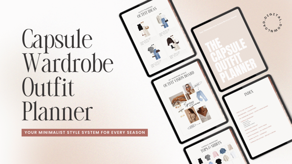
Build a Capsule Wardrobe You’ll Actually Wear
A planner that turns your closet into a clear, intentional system.
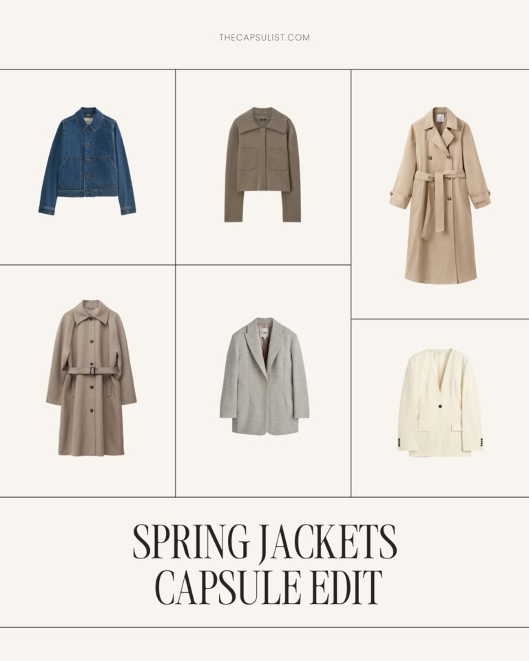
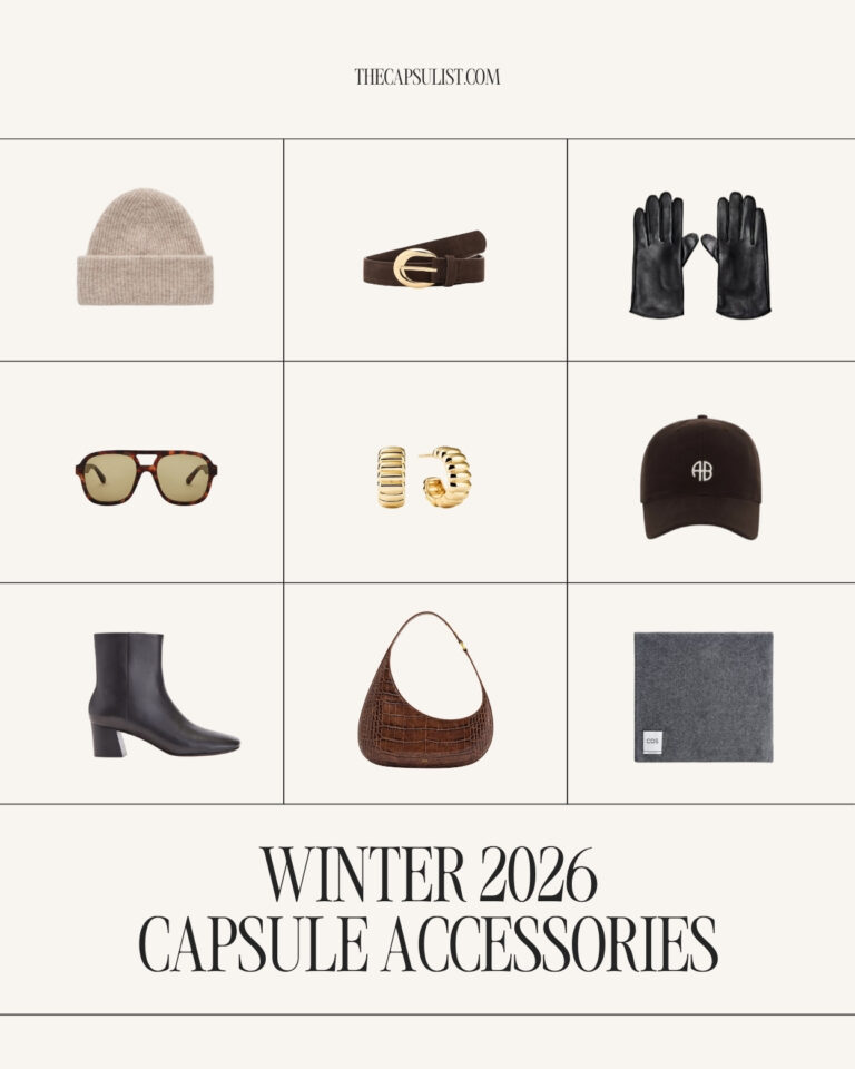
Core Neutral Colors for a Capsule Wardrobe Color Palette (2026)
Most modern capsule wardrobes are built around 4–6 core neutrals.
Here are the most reliable foundations for 2026:
Black
Grounding and sharp. Best used intentionally, not everywhere.
Ivory / Soft White
Warmer and more wearable than stark white. Ideal for tops, knits, and layering pieces.
Taupe or Camel
Softens black, elevates simple silhouettes, and works across all seasons.
Chocolate Brown
A richer alternative to black — especially strong in leather and outerwear.
Soft Grey
Calm, understated, and highly versatile. Ideal for tailoring and knitwear.
You don’t need all of them.
You need the ones that work together on you.
How Many Colors Do You Actually Need?
Less than you think.
For most minimalist wardrobes:
- 3–4 core neutrals are enough
- 1 optional accent tone, used sparingly
If everything layers easily, you’ve chosen well.
If outfits only work when styled carefully, your palette may be too wide.
Most capsule wardrobes work best when all colors can be mixed effortlessly — without planning or overthinking.
Cool vs. Warm Palettes (and How to Choose)
This is where many capsules quietly fail.
Cool-leaning palettes often include:
- black
- charcoal
- soft grey
- crisp white
Warm-leaning palettes tend to use:
- ivory
- camel
- taupe
- chocolate brown
Neither is better.
If gold jewelry feels effortless → lean warmer.
If silver always looks right → cooler tones may suit you better.
Certain materials and silhouettes carry color especially well — especially footwear.
For neutral, capsule-friendly options that work across palettes, see:
Capsule Wardrobe Shoes 2026 – 8 Timeless Pairs Every Minimalist Needs
Seasonal Shifts Without Changing the Palette
A strong capsule palette doesn’t reset every season.
Instead:
- fabrics shift
- proportions lighten or layer
- contrast softens or deepens
Spring and summer rely more on:
- ivory
- light taupe
- soft greys
- white
Fall and winter lean into:
- brown
- black
- deeper neutrals
The palette stays the same — only the weight and texture change.
→ See how the same palette translates across the year:
- Spring Capsule Wardrobe — Timeless Transitional Staples
- Summer Capsule Wardrobe — Lightweight Essentials for a Minimal Closet
- Fall Capsule Wardrobe — Classic Layers for a Timeless Closet
- Winter Capsule Wardrobe — Minimalist Essentials
Each season builds on the same foundation — nothing starts from zero.
Common Capsule Wardrobe Color Mistakes
Even minimalist wardrobes fall into these traps:
- choosing too many shades of the same neutral
- mixing warm and cool whites unintentionally
- building around accent colors instead of neutrals
- buying “almost matching” pieces
If something feels hard to style, it’s usually a color issue — not a styling one.
How This Fits Into the Capsule Wardrobe System
Color comes after essentials — not before.
First, define the pieces you actually need.
Then, choose colors that allow those pieces to work together.
For the complete framework — from color palette to core essentials — start with my
Capsule Wardrobe Guide: How to Build a Timeless, Minimal Closet
And for a clear reference list of what to include, see:
Capsule Wardrobe Essentials — A Timeless Checklist for a Minimalist Closet (2026)
Build Calm, Not Contrast
A capsule wardrobe color palette should feel quiet.
Not restrictive.
Not flat.
Just easy.
When colors stop demanding attention, the wardrobe starts supporting real life.
Less contrast.
More consistency.
A closet that finally makes sense.
✨ If you prefer a structured, printable way to map your colors and outfits, the
Capsule Wardrobe Planner offers a clear system for building a cohesive wardrobe step by step.